iPhone 18 Pro’s ‘Dark Cherry’ — Practical impacts of the new color

Color as product strategy
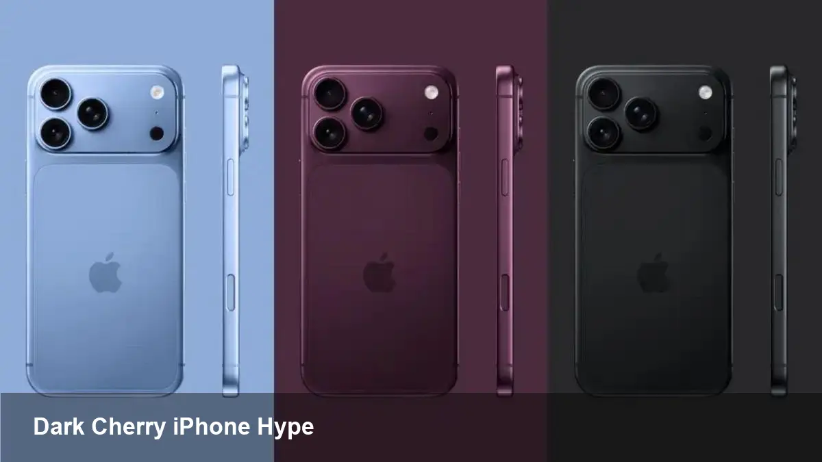
Apple has long treated finish options as more than decoration — they are a subtle product strategy that shapes purchase decisions, accessory ecosystems, and even aftermarket pricing. The upcoming Pro models appear to follow that pattern: recent supply-chain reports identify a new signature hue called Dark Cherry, described as a deep, wine-like red, among a four-color lineup for the iPhone 18 Pro family (including the Pro Max and the rumored foldable iPhone).
Color choices do several jobs at once. They refresh a product cycle without changing hardware specifications, give marketing teams a focal point for campaigns, and create opportunities for accessory makers and carriers to bundle differentiated offers. For users, a new finish can signal status, express personal taste, or make a device easier to spot in a bag.
What the Dark Cherry rumor actually suggests
The main takeaway from the leak is that Apple may push a darker, wine-toned red as the headline finish for the Pro tier. Descriptions emphasize depth and subtlety rather than bright or candy-apple red. The rumor also implies the Pro line (including the larger Pro Max and the expected foldable model) will share color options or at least a common signature hue.
Why that matters: a darker red reads as premium and mature compared with vivid reds aimed at younger buyers. It’s also more compatible with metal and glass finishes that emphasize texture and reflectivity, which are common in Apple’s higher-end builds.
Three practical scenarios where color choice matters
- Retail differentiation: Carriers and retailers frequently build promotions around exclusive finishes or early stock of a new color. A Dark Cherry Pro could be the centerpiece of limited-time bundles — for example, pairing the device with leather cases and earbuds in complementary tones.
- Accessory planning: Case manufacturers and screen-protector suppliers will want to prepare swatches and marketing images that match the new hue. A muted wine-red finish will push case designers toward leather, matte silicones, and brushed-metal accents rather than transparent or neon styles.
- Enterprise procurement: Businesses often standardize on a single color for fleet devices. A recognizable, darker Pro color can influence decisions around visual uniformity and device management branding — particularly for consumer-facing staff where device aesthetics matter.
Developer and app-design considerations
On the surface, a new phone color doesn’t change how apps are built. But there are subtle UX and marketing angles to consider:
- Imagery and screenshots: Apps that display device mockups in marketing materials should update assets to show the new finish, especially for app store feature screenshots or landing pages targeting iPhone users.
- AR and camera apps: A darker glass tint can slightly alter color balance and reflections in photos or AR scenes. Teams working on camera filters or color-sensitive AR experiences should test on the new finish during the prelaunch period.
- Accessory-driven features: Apps that tie into accessories (cases with NFC tags, stylus pairing, etc.) should coordinate with accessory vendors who will map launches to the new color.
Production realities behind a new finish
Creating a distinctive color at scale involves more than picking a Pantone. Manufacturers must decide on glass tints, metallic frame coatings, and processes like physical vapor deposition (PVD), electroplating, or anodization. Matching color across glass, metal, and accessory materials is technically demanding and can lead to staggered availability or regional shortages.
For Apple, that often means a prioritized roll-out: the headline color ships globally in limited quantities at launch while other finishes follow. That distribution strategy can create perceived scarcity and buzz — but it also produces headaches for supply-chain partners and accessory makers who need stable forecasts.
Business implications and market signals
- Resale and collectibility: Historically, new or unusual finishes command higher resale prices in the short term. A Dark Cherry Pro that’s limited at launch could create a collector market for early adopters.
- Marketing angle: Apple’s marketing teams tend to highlight a single signature color during launch windows. If Dark Cherry becomes that anchor, expect ad creative, in-store displays, and influencer content to align around wine-toned visuals.
- Carrier strategies: Carriers will likely use the new hue in trade-in promotions and device upgrade campaigns, tying financial incentives to customers who choose the standout color.
Three forward-looking insights
- Personalization will stay strategic: As hardware evolution slows, color and finish become low-cost levers for perceived innovation. Expect more seasonal or limited-run colors rather than major design overhauls.
- Accessory ecosystems will tighten cycles: Case makers and retailers who can rapidly prototype and launch matching products will capture more early-season sales. Quick-turn production and accurate color samples will be a competitive advantage.
- Supply-chain agility matters more than ever: Brands that handle color and finish changes well will avoid frustrating shortages. Companies downstream — from case manufacturers to carriers — should build contingency plans for staggered color availability.
What to do now if you’re planning to buy or sell
- If you want the Dark Cherry specifically: be prepared for a possible short window at launch. Sign up for retailer or carrier alerts and consider preordering on day one.
- If you make accessories: start color-matching experiments now. Even a small preorder run tied to the rumor can pay dividends if the finish becomes popular.
- If you manage devices for a business: decide whether a standout finish will help or hinder standardization. If uniformity is critical, order early to avoid mixed fleets.
Apple’s color choices are small design moves with outsized downstream effects — from marketing narratives to manufacturing timelines. Whether Dark Cherry becomes the definitive look for this cycle or simply one notable option among four, the ripple effects will be felt across retail, accessories, and the ways people present their devices publicly.