How Little Finder Guy is Teaching Mac Tricks on TikTok

A tiny mascot, a big marketing move
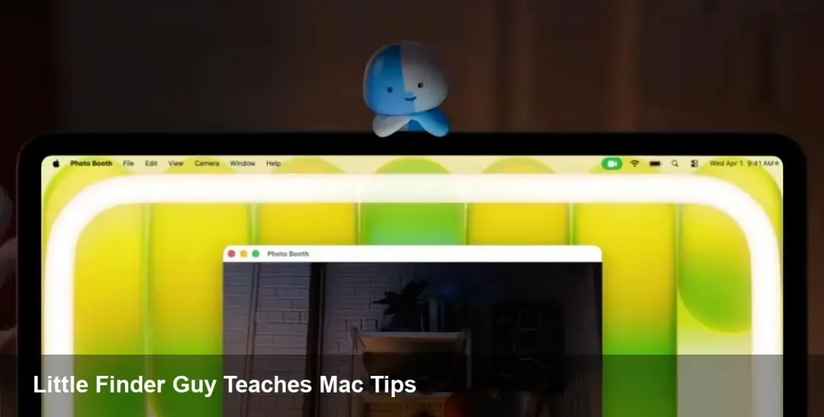
Apple has quietly been experimenting with short-form education on TikTok, and its latest creative — the little anthropomorphized Finder icon, nicknamed Little Finder Guy — is more than cute branding. After first appearing in early March around the MacBook Neo launch, Little Finder Guy now anchors a trio of short tutorials that highlight practical macOS features: desktop Stacks, a system ring-light for video apps, and improved dictation.
This isn't just a campaign to drive likes. It's a focused play to increase feature adoption, reduce friction for new Mac users, and make otherwise hidden productivity tools discoverable in a medium younger users and creators actually consume.
The three short lessons and why they matter
Apple's recent TikToks are intentionally simple but purposeful. Each demo maps to a real use case:
- Stacks: A quick visual shows messy desktop icons consolidated into tidy stacks by file kind, showing how a single gesture can restore a scattered workspace. For remote workers or designers keeping dozens of downloads, this instantly reduces time wasted hunting for files.
- Ring light for video apps: Demonstrating an on-screen ring-light effect for video calls and streaming, the clip targets creators and hybrid workers who want better-looking webcam feeds without buying extra hardware.
- Dictation: The third video highlights macOS dictation and voice-to-text, presenting it as a fast way to compose messages, notes, or drafts when typing isn’t ideal.
The tutorials are short, snackable, and mapped to concrete pain points: clutter, poor webcam lighting, and slow typing. That alignment is why this marketing feels more like customer support than traditional advertising.
Real-world scenarios where these features help
Think of three everyday profiles and how Apple’s tactic nudges each user toward higher productivity:
- Freelancer: A freelance UX designer receives assets in a flood of downloads. Stacks automatically groups PSDs, JPGs, and PDFs, making file retrieval faster and client handoffs cleaner.
- Creator/Remote worker: A content creator joining a Zoom call from a cramped apartment can toggle the on-screen ring light or use the camera settings Apple showcases to improve frame quality without expensive gear.
- Writer with physical constraints: A journalist or developer with carpal tunnel can use dictation to draft emails, commit messages, or notes hands-free, then edit quickly with keyboard shortcuts.
By packaging these how-tos into TikToks, Apple shortens the discovery path from unawareness to active use.
Why the marketing approach is notable for product teams
Apple is treating a UI element (Finder) as a micro-mascot and using it to humanize the OS. That has practical consequences:
- Product adoption: Short, focused videos make advanced features approachable. Companies with deep product stacks should measure how tutorial content correlates with feature usage.
- Support ROI: If users learn to clean desktops or enable dictation via social clips, support tickets and forum threads could decline.
- Brand alignment: The Finder icon is iconic to macOS users. Animating it creates an emotional hook that plain UI copy never will.
For product managers and growth teams, this is a reminder: give people a face, a story, and a one-step action.
Implications for developers and app makers
Apple’s choice of features and platform matters to third-party developers who build on macOS:
- Integrate with system features: If your app manipulates files, respect Stacks-friendly metadata and file-type organization so users don’t experience conflicts. If you offer video conferencing, ensure compatibility with Apple’s ring-light settings or camera effects.
- Accessibility first: Dictation improvements are beneficial across apps. Devs should support Voice Control labels, accessible text fields, and live transcription hooks where appropriate.
- UX discoverability: Follow the lead: embed micro-tutorials and short demos inside your app or marketing channels. A 20–30 second clip showing a single, valuable action can drive far more adoption than dense documentation.
Business value beyond impressions
There are measurable gains beyond viral views. Educated users are stickier users. When a feature demonstrably improves daily workflow, two things happen: users extract more value from the device and they are likelier to remain within the platform ecosystem. For Apple, nudging MacBook Neo owners to use these macOS capabilities increases perceived differentiation from Windows machines and cheaper Chromebooks.
For enterprise buyers, the benefits compound: smaller training investments, fewer helpdesk calls, and higher productivity per seat. IT teams evaluating device fleets should watch whether corporate adoption metrics (e.g., dictation usage, file organization behaviors) shift after campaigns like this.
Limitations and risks
There are a few caveats to consider:
- Over-simplification: Short videos can't replace deeper onboarding for power users. Some advanced behaviors need richer tutorials, in-app walkthroughs, or documentation.
- Feature awareness vs. mastery: Discovering a feature is step one; forming efficient habits requires repetition and integrated workflows.
- Perception vs. reality: Promoted features must deliver consistently across hardware generations. If ring-light effects or dictation quality vary on older MacBook models, users might feel misled.
Three forward-looking takeaways
- Short-form content will become a standard channel for platform education. Expect more OS vendors to create micro-personas or mascots that help users discover features in native workflows.
- Accessibility features — like dictation — are a logical focus for growth teams because they benefit a wide range of users and can be promoted without hardware changes.
- Developers who prioritize compatibility with system-level enhancements (camera/lighting settings, voice input, file organization) will see better engagement and fewer support headaches.
Apple’s Little Finder Guy may be tiny, but the strategy behind it is big: combine iconic branding with practical, bite-sized education to move users from curiosity to habit. For product teams, marketers, and developers, the campaign is a useful case study in turning a familiar UI element into a vehicle for real user uplift.