Bolder Pixel Weather Icons: What It Means for UX

Why Google refreshed Pixel Weather icons
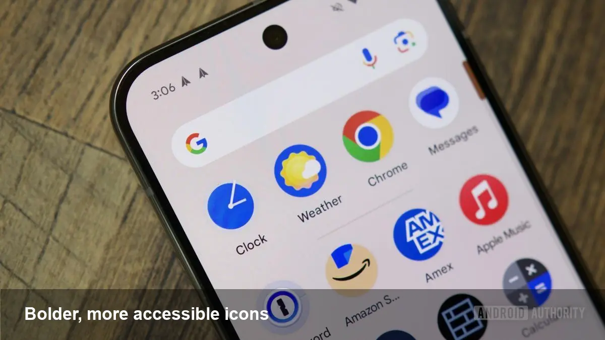
Google has recently updated the weather visuals that appear across Pixel phones and widgets. The change isn’t just cosmetic: it prioritizes clearer shapes, stronger contrast and simpler silhouettes so users can read conditions at a glance. For a feature people check dozens of times a day, that immediate legibility matters.
The update lives in Pixel Weather elements across the system — notifications, the Pixel Launcher widget and in the dedicated weather UI — and aims to reduce ambiguity for users with low vision or color vision deficiencies while improving recognition for everyone.
What changed — a practical view
Instead of subtle line art and soft fills, the new set leans into heavier strokes and more pronounced fills. Key characteristics include:
- Larger, simpler iconography: clouds, sun, rain and snow are defined by fewer details and stronger geometry.
- Increased contrast: darker lines and bolder fills make icons stand out against different wallpapers and widget backgrounds.
- Reduced color reliance: where previous imagery used nuanced tints to convey meaning, the new set emphasizes shape so function isn’t lost for colorblind users.
This approach mirrors accessibility-first strategies used in other interface elements — favoring form and contrast over decorative nuance.
Real-world scenarios where the update helps
- Morning commute: When you’re walking to the bus and quickly glance at your phone, a thicker cloud or bold rain droplet is much easier to parse in bright outdoor light.
- Color-vision differences: Someone with deuteranopia might not distinguish pale blue from gray; shape-first icons remove that dependency on hue.
- Low-light situations: On a bedside table at night with Do Not Disturb on, a compact, high-contrast icon is less likely to be misread when you only have a split-second view.
Those micro-interactions add up. Improving quick recognition reduces cognitive load across hundreds of interactions per month.
Why designers and product teams should take note
Even if you don’t ship a system-level weather app, the principles here are broadly applicable:
- Make meaning legible without color. Use distinct silhouettes and prioritize shape language so iconography still communicates when color information is unavailable.
- Design for contrast across contexts. Test icons on diverse backgrounds (light, dark, patterned) and with common accessibility filters.
- Prefer clarity over ornamentation. Minimal, bold visuals scale better across sizes — from tiny notification icons to large widgets.
For consumer products, accessibility improvements can directly affect retention and user satisfaction. Small improvements to glanceable UI produce outsized wins in daily utility.
Developer implications and practical checklist
If you’re a mobile developer wanting to match system-level accessibility or simply improve your app’s weather/metered indicators, consider this checklist:
- Use vector assets (SVG/VectorDrawable) so shapes remain crisp at any size.
- Design alternate glyphs, not just recolors — provide shape differences for semantic states.
- Follow contrast guidance (aim for a WCAG-like ratio on small UI elements) and test with simulators and color-blindness filters.
- Expose semantic labels (contentDescription on Android) so screen readers can convey the same concise information.
- Respect dynamic scaling and widget contexts — icons that work well in a large widget may need different stroke weights for notification use.
Applying these practices keeps your visuals consistent with modern system UX and supports a wider audience.
Business value: accessibility as product advantage
Accessibility-driven design has measurable business benefits:
- Reduced support friction: Clearer UI means fewer misunderstandings and fewer support requests.
- Wider reach: Improving legibility opens your product to users with visual impairments and older adults.
- Brand trust: Consistently readable interfaces convey product maturity and attention to detail.
For companies shipping consumer devices or apps, system-level updates like Pixel’s provide both a template and a competitive nudge: users begin to expect this level of clarity elsewhere.
Limitations and trade-offs
There are trade-offs to the bold, simplified approach:
- Loss of nuance: Highly stylized or detailed branding may not translate well into the reduced visual vocabulary.
- Consistency challenges: Third-party apps that keep older, detailed icons can look visually out of place alongside the new system icons.
- Rollout scope: These updates typically arrive first on specific device lines; broader Android ecosystem adoption may lag.
Knowing when to prioritize functional clarity and when to preserve brand personality is part of a pragmatic design strategy.
Three implications for the wider UX ecosystem
- System-first accessibility influences third-party design choices: When platform visuals move toward higher contrast and simpler shapes, app developers will increasingly follow to maintain visual harmony.
- Design systems will embed accessibility tokens: Expect more UI kits to include alternate glyph sets and contrast-aware components as defaults.
- Data-driven iconography becomes more viable: As icons get simplified, adding small micro-animations or live fills (for precipitation intensity, for example) can convey richer information without losing legibility.
How to evaluate whether to adopt this approach
Run micro-tests: A/B icons in notifications and widgets, measure glance recognition time in usability tests, and track metrics like session retention and help queries related to weather features. If glanceability and low-friction information delivery are core to your product, a bolder, shape-forward icon set is an easy win.
These pixel-level changes may look modest, but they reflect a larger trend: design decisions that foreground accessibility are becoming the default. If your product relies on quick, glanceable information, taking a page from this update will likely improve both usability and user satisfaction.