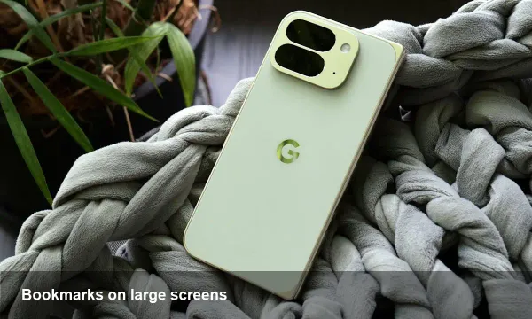
Why the Nothing Phone 4a is a practical pivot from Phone 3

A quick primer on Nothing and its design gamble
Nothing launched as a consumer hardware startup with a mission to make phones that feel different. Founded by industry veteran Carl Pei, the company built early brand identity around transparent aesthetics and a distinct visual language — the Glyph LED system, signature fonts, and a minimalist UI. That push for design distinctiveness paid off in brand recognition, but it also set expectations: Nothing phones are supposed to be eye-catching, premium-feeling devices.
The Phone 3 was presented as the latest premium expression of that approach. It leaned into bold styling and a flagship-sized footprint. For some buyers the result looked and felt compelling; for others, the device's size and day-to-day practicality were pain points.
Enter the Phone 4a: not a radical stylistic reinvention, but a strategic course correction. It pares back a few of the more polarizing choices of the premium model to deliver something that fits more easily into real life.
Two customer complaints that matter more than you think
When designers and product teams argue over features, they often focus on specs: camera megapixels, refresh rates, battery chemistry. But for many users — especially commuters, multi-device workers, and people who want a single phone for business and personal life — a device's physical interaction matters more.
There are two practical issues Phone 4a targets:
- Pocketability and single-handed comfort. If a phone is hard to slip into a pocket, or impossible to use one-handed, it quickly becomes a daily annoyance. Phone 3's premium ambitions made it larger and heavier in the hands of some users.
- Everyday utility over headline features. Shiny design flourishes are nice, but users care most about how a phone performs across a full day: battery endurance, convenience of use, and compatibility with accessories and pockets.
Nothing's 4a appears to accept that trade-off: flatter, slimmer silhouettes and a more restrained external design keep the brand cues but yield a more ergonomic device.
What changes in practice — scenarios that matter
Here are realistic everyday examples where the Phone 4a's approach pays off:
- Commuting on public transit: A smaller, lighter phone is easier to manage on crowded trains. You can hold a rail with one hand and still scroll or send a message with the thumb of the same hand.
- Pocket-first lifestyles: For people who carry light — no bag, just a phone, keys, and maybe earbuds — a more compact phone reduces friction. It doesn't snag, it sits flat, and it won't force you to rearrange pockets.
- In-pocket photography: Smaller phones are easier to retrieve quickly for a spontaneous photo. When every second counts, the speed of access is an underrated metric.
- Device testing and app design: For developers and UX designers targeting a broad audience, a mid-sized phone is a useful testbed because it represents the majority of devices in circulation. Designing for ergonomics on a phone like the 4a helps improve usability for most users.
Trade-offs and what Nothing likely gave up
To get pocketable and practical, Nothing had to trim or re-balance some choices. Expect these kinds of trade-offs:
- Less emphasis on ultra-premium materials and large, attention-grabbing hardware features. That helps lower cost and weight but reduces the "wow" factor for some buyers.
- A more conservative external look. The Glyph and other signature elements likely remain, but dialed back to prioritize function.
- Potential variation in top-tier camera or display specs compared with the Phone 3 flagship. The goal is better all-day behavior rather than headline benchmark wins.
Those trade-offs are intentional: they prioritize frequent, real-world interactions over occasional delight.
What this means for developers, startups, and B2B buyers
- Device compatibility and testing: If you build apps with real users in mind, testing on a more pocketable device like the 4a will surface different ergonomics issues than testing exclusively on large flagships. Button placements, reachability of in-app controls, and one-handed gestures deserve attention.
- Procurement for teams: For companies buying phones for staff, a lighter, cheaper model that keeps key Nothing design cues can be attractive. It reduces replacement cost and improves user comfort without abandoning the brand.
- Accessory ecosystem: Case makers, wireless charger manufacturers, and accessory developers will adapt layouts and packaging for a smaller device, which can simplify supply chains and logistics.
Larger strategic implications for Nothing
- Broadening the product ladder: By offering a midrange, pocket-friendly model, Nothing signals a move toward a multi-tier product lineup. That helps capture users who like the brand but didn't want a flagship-sized device.
- Brand maturation: Early-stage consumer hardware brands can get trapped in a loop of differentiating by looks alone. A focus on everyday utility shows Nothing is shifting toward sustainable product design that balances identity with practicality.
- Volume and ecosystem play: Smaller, more affordable models usually sell in larger volumes. That gives Nothing more leverage to build accessories, partnerships, and developer interest in its software layer.
Who should consider the Phone 4a?
- Buyers who admired the visual language of Phone 3 but found it too large or flashy. The 4a keeps the DNA while prioritizing ergonomics.
- Developers and designers who want to test apps on a realistic, one-handed device.
- Businesses procuring devices for staff where comfort and cost matter more than flagship features.
If you loved the aesthetics but seldom used the Phone 3 as your daily driver, the 4a looks like the pragmatic follow-up: fewer headline specs, more everyday wins.
What to watch next
The Phone 4a is a helpful reminder that design-led brands can pivot toward utility without losing identity. Watch for how Nothing prices the 4a, how it positions the Glyph and software features, and whether the company continues to expand into multiple SKUs. Those moves will reveal whether the company is building a broad consumer ecosystem or sticking to occasional premium drops.
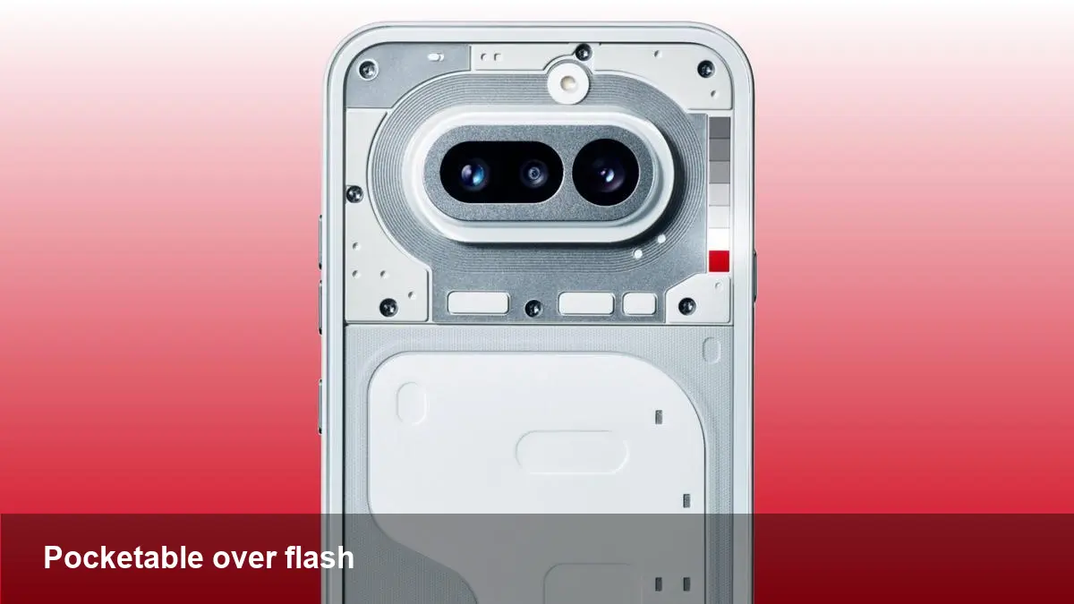
For anyone deciding between flash and function, the 4a is an invitation to choose function — and to discover that a smaller, simpler device can be the one you actually use every day.