Why Apple’s new MacBooks use glyphs on the keyboard

A quieter change that hits your fingertips
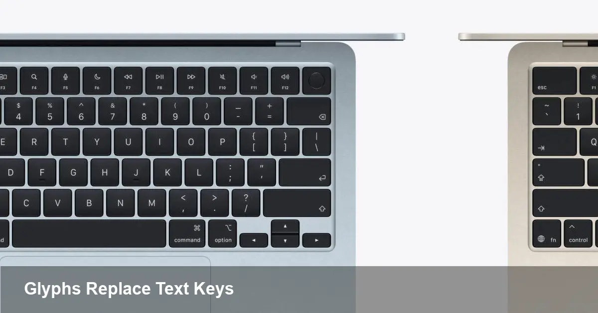
Apple recently updated the labeling on its laptop keyboards: several keys that used to carry short text labels now show small pictograms instead. It’s a subtle visual change, but one that ripples across everyday use, support, and software. For anyone who types, teaches shortcuts, or ships MacBooks in bulk, the swap from words to glyphs matters more than you might initially expect.
A bit of background
Apple has long iterated on keyboard design — from compact laptop layouts to the return of stable scissor-switch mechanisms and removal of the Touch Bar. Part of that design language has always been visual clarity and internationalization. Moving to glyphs reduces reliance on written language on the plastic keycaps and leans into universally recognizable symbols instead.
Design-wise, glyphs are smaller, cleaner and match the iconography used across macOS. For Apple, that consistency can improve aesthetic coherence across the product line and simplify keycap tooling for multiple-language markets.
What changed — and what didn’t
Practically speaking, the physical function of every key remains the same. The keyboard still sends the same key codes, and macOS maps those codes to system actions and shortcuts as before. The visible difference is purely an aesthetic and usability decision: words like “Delete” or “Caps Lock” (which previously appeared on some models) are now replaced by compact pictograms.
Because the underlying hardware and key mappings aren’t altered, software that listens for key events (apps, utilities, games) won’t need to change. But users who learned commands by reading label text may notice a small friction when they first switch models.
Real-world scenarios where it matters
- New hires and non-English speakers: In environments with lots of international staff or rapid device turnover, removing text labels reduces the need for language-specific keycaps. However, trainers may have to adjust since new team members can’t rely on text as a visual cue.
- Power users and shortcuts: People who teach or learn keyboard shortcuts by glancing at legends (for example, while transitioning between macOS and Windows keyboards) might pause when a familiar word is replaced by a symbol.
- Assistive setups and public kiosks: Organizations that run public workstations or labs often add overlays or stickers to guide users. Those materials may need redesigning to reflect the new glyphs.
What IT admins should plan for
- Documentation updates: Any internal cheat sheets, onboarding slides, or quick-reference cards that show key names should be reviewed and updated to match the new symbols.
- Training cadence: Onboarding that previously relied on printed key labels will benefit from a small update — add a slide that explains the glyphs and maps them to macOS actions.
- Hardware procurement: If your organization standardizes on keyboards with textual labels for accessibility reasons, audit incoming device models and update procurement specs accordingly.
- MDM and configuration: No software-level changes are required to support the glyphs, but administrators might want to push a short “how-to” or PDF explaining the new legends via MDM tools during device enrollment.
For developers and power users
- No API changes: Key codes and modifier behavior don’t change, so applications that rely on event handling, keyboard shortcuts, or automation continue to work as before.
- UI hints and onboarding: Apps that display keyboard shortcuts within the UI (help menus, tooltips) should still show the canonical key names or glyphs consistent with macOS. Consider adding a brief visual in app help if your user base often switches between Apple and non-Apple keyboards.
- Remapping and utilities: Tools like Karabiner-Elements or other remappers will function exactly the same. If you ship devices with preconfigured overlays or custom keycaps, ensure your physical legends match what users will see.
Practical tips to smooth the transition
- Add an icon legend to onboarding materials: A single-page image that pairs each new key glyph with the old word (and the macOS action) will clear up confusion quickly.
- Encourage the Keyboard Viewer: macOS includes a visual Keyboard Viewer that shows current key mappings. Pointing new users to it can bridge the gap while they adapt.
- Consider tactile cues: If your users are heavily reliant on visual text, small stickers or silicone keyboard covers with text can be a cheap interim fix for labs or kiosks.
- Update screenshots and videos: Training videos and help center images should show the new glyphs to avoid cognitive mismatch.
Why Apple might prefer glyph-first keyboards
There are a few strategic reasons for the change. Glyphs are language-agnostic, simplifying global manufacturing. They align with the icon-based UI Apple cultivates in macOS, iOS and watchOS. And visually, glyphs can reduce clutter and make keyboards look cleaner — a consistent design impulse across Apple’s product range.
From an accessibility perspective, glyphs reduce the need for localized printing on keycaps. At the same time, they place more emphasis on software-based assistive tools and documentation to explain functions.
Two implications to watch next
1) More symbol-driven hardware: If this trend continues, expect other input devices and accessories to favor icons over words — and possibly more context-aware control surfaces that change icons dynamically (think e-ink or tiny OLED key labels).
2) A small demand for hybrid solutions: For workplaces that need both language-specific labels and universal icons, third-party keycap vendors or switchable overlay solutions may see renewed interest.
The glyph swap is a minor physical change with a relatively low technical cost, but it’s an important reminder: even cosmetic updates to hardware can have measurable effects on users, training, and device fleets. For most people the adjustment will be quick — and after a few days you’ll likely stop noticing the difference at all.